Recently in our media lesson we annotated the contents page of music magazines. To do this we used word to annotate them then used a website called Prezzi to upload it. Here is my work
http://prezi.com/ghedkdy89-b8/analysing-contents-pages/
Sunday 31 October 2010
Wednesday 13 October 2010
Annotations of music magazines


Initial Plans for my magazine
After doing my research on music magazines my plans for my magazine are as followed
- Price: £2.30
- Frequency of publication: once a month
- Average issue size: 176 pages
- regular content: upcoming gigs, top of the charts
- featured articles: Interviews
Tuesday 12 October 2010
Codes and conventions of a double page spread

Main image which takes up a whole page and sometimes goes across the page this is called "Bleeding"
Page number along with the name of the magazine and a website
Magazine name
Issue date
Drop cap
Main title
Theme
Size 11 font
Lots of writing
The artists of the band are usually on the left side page
A consistent theme
It is written in an informal way
Stand first-usually above the article
Bylines
3-4 columns
Drop quotes
Monday 11 October 2010
Researching the market place

Price: £2.20
Frequency of publication: once a week
issue size: about 63
Regular content: upcoming artists and events
Feature articles: interveiws with artists

Postioning statement: New Musical Express
Frequency of publication: once a week
issue size: 66
regular content: interveiws with artists
feature articles: upcoming artists, reviews, competition and bonus features
http://www.nme.com/
postioning statement: LIFE IS LOUD
Initail Ideas
For my main task the genre i am going to choose is indie/rock. This is because i like to listen to this type of genre. The target audience i am going to choose is the ages between 13-20+.
Sunday 10 October 2010
Evaluation
My magazine uses the forms of codes and conventions of a real life magazine because the front cover has:
cover lines down the sides, 3-4 simple colours such as mine are blue, black and yellow, the masthead makes the genre very clear. It also has featured articles advertised on the front cover such as school trips. The main cover line is a bigger font than all the others to make it stand out as the main story. It also includes a website and issue date and a main image. However my magazine also challenges the codes and conventions because it does not include a bar code.
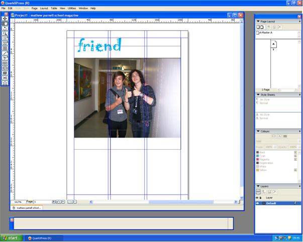
I have already used photo shop to make previous magazines back at GCSE level, but i developed new key skills during the production of my front cover. Also i used a new format called Quark which i have never used before. I used this to design my contents page. I learned new skills on this such as how to re size the picture to fit into the box and to put a shadow drop on the boxes which hold the numbers of the page in. I found Quark easier to use than photo shop because all the tools were really simple to follow and there are guidelines to stick to so everything comes out neater.
The strengths and weaknesses of my product vary. Some strong points of my product are; the title, i especially like the title because it makes the genre very clear and the font it is used in is cursive which is what most school students are taught to write in. Another strong point about my magazine is The contents page structure. I think it looks very professional and the theme of black and yellow makes it easier to stand out what page you are looking for. However a weakness about my finished product is the main image of my front cover. The colour writing to go over the background was very difficult to choose as the background its self was different colours. Another weakness about my product is some of the photo's were a bit rushed and i think if i had more time i would of got a better quality of photo's. A weakness of the new media technologies i used is on photo shop the magnetic tool is very difficult to use. A strength would have to be how easy it is to make something look professional on Quark because of how easy it is set out.
cover lines down the sides, 3-4 simple colours such as mine are blue, black and yellow, the masthead makes the genre very clear. It also has featured articles advertised on the front cover such as school trips. The main cover line is a bigger font than all the others to make it stand out as the main story. It also includes a website and issue date and a main image. However my magazine also challenges the codes and conventions because it does not include a bar code.
I have already used photo shop to make previous magazines back at GCSE level, but i developed new key skills during the production of my front cover. Also i used a new format called Quark which i have never used before. I used this to design my contents page. I learned new skills on this such as how to re size the picture to fit into the box and to put a shadow drop on the boxes which hold the numbers of the page in. I found Quark easier to use than photo shop because all the tools were really simple to follow and there are guidelines to stick to so everything comes out neater.
The strengths and weaknesses of my product vary. Some strong points of my product are; the title, i especially like the title because it makes the genre very clear and the font it is used in is cursive which is what most school students are taught to write in. Another strong point about my magazine is The contents page structure. I think it looks very professional and the theme of black and yellow makes it easier to stand out what page you are looking for. However a weakness about my finished product is the main image of my front cover. The colour writing to go over the background was very difficult to choose as the background its self was different colours. Another weakness about my product is some of the photo's were a bit rushed and i think if i had more time i would of got a better quality of photo's. A weakness of the new media technologies i used is on photo shop the magnetic tool is very difficult to use. A strength would have to be how easy it is to make something look professional on Quark because of how easy it is set out.


Wednesday 6 October 2010
Quark demonstration
Sunday 3 October 2010
front cover on photoshop


Next we had to upload the photos onto the computers and start making our front cover.
as you can see the last 2 pictures are screen grabs of my work. I cut around the person in my photo using the magnetic lasso on photoshop the last picture is what i have so far.
Subscribe to:
Posts (Atom)