This is my front cover at the start, I added two lines red and blue and the title was in its own unique font.

After some thought i decided to take away the red and blue lines and add a block red colour box at the top and a black block colour box at the bottom. I also added in my first cover line.

The next stage of my front cover was

adding in another cover line and have the main cover line at the bottem in its own unique font.
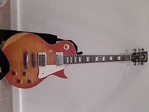
Next i added in the picture, the sub-line, more cover lines, changed the black box to a red box with other artists inside, i added a bar code and changed the main cover line to a different colour and made it bigger.
After a lot of thought i decided to re-do my fron cover entirely. I changed the picture the fornt of the title the colour of the cover lines the positioning of the main cover line made the bar code smaller and got rid of the red box at the top.

The next few changes for my front cover was to change the main cover line to "rock five" and get rid of the red box.


The final changes i made to my front cover was to make the picture bigger add in a date and website and made "rock five" bigger and in the colour red.
As you can see from the start of my product my music magazine has changed a great deal this shows my skills have developed a lot and my knowledge of making a magazine.


 drop capital and changed the font of the text and the title.


 adding in another cover line and have the main cover line at the bottem in its own unique font.


 The final changes i made to my front cover was to make the picture bigger add in a date and website and made "rock five" bigger and in the colour red.